
Scraping and analysis of the Crossfit Opens data
Hello in this article, I am going to give some leads on how to create a web scraping system that has been used to collect some data from the Crossfit games website of Reebok
Introduction to Crossfit
The Crossfit is defined as
a strength and conditioning program consisting mainly of a mix of aerobic exercise, calisthenics (body weight exercises), and Olympic weightlifting
This program seems to have been invented in the 2000s by Greg Glassman and Lauren Jenai, and the sport is licensed under the name of CrossFit, Inc.
I invite you to take a look at some videos on the Crossfit Inc channel on YouTube to have a better view of what the exercises to do during a session could be.
In my case I have been practicing crossfit since August 2017, three times per week and I like it. Honestly when I started I was looking at the sport as some brutes that were doing gym exercises at high intensity.
More seriously, I was a little bit afraid of the intensity of the exercises that from my point of view could hurt people pretty badly, but this sport is made for everybody. No need to be Superman to practice crossfit.
The strength is that every exercise can be scaled in terms of weight and movement as a function of your needs (physical condition, injuries) but the only goal is to complete the exercise. Never giving up could be the motto of crossfit.
The selection for the world cup championship is quite simple, there is 3 phases in the process:
- The Open, everybody can participate in this qualification, the divisions are defined by age and gender and if you are not at an affiliate gym that can validate your performance you can film it and send it to the organizers.
- The Regionals, where the best from the Open will compete to be selected for the Games
- The Games, the world cup
For this article, the data collection will be only the Open 2018 data that can be found at this address. The Open are defined by:
- A period of 5 weeks, where every week a new WOD (workout of the day) is announced
- There are 4 days to try to make the best score on the WOD
So why I want to use this case for my introduction to web scraping:
- I read a cool article on the scraping of the Crossfit games website
- I found the presentation of the leaderboard quite limited in term of comparison
- I wanted to make a web scraping exercise for a long time
So let’s dive in it.
Web scraping 101
In this case I decided to scrape the following elements:
- the leaderboard pages for this article we will just be working on the result for 2018 but if you want the approach for the previous year I invite you to look this article on the topic
- the athletes pages, because every athlete has a page with some interesting informations
- the gym pages that contains some details on the location of the gym
To collect the data from this website, I used the package called Beautiful Soup, which is quite popular for web scraping in Python. In the following sections there will be a description of the data collected and the code associated.
You can find all functions explained in this part in this GitHub repository.
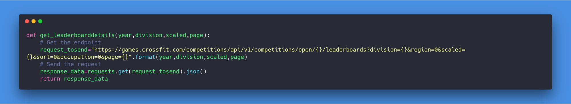
The leaderboard
There is no proper need to scrape the webpage, the API that is used by the frontend can be called directly by a simple GET request. Thanks to @pedro for noticing that. There is just a need to mention in the request:
- The code of the division
- If the leaderboard concerns the scaled or non-scaled athletes
- The page of the API (that you can get from the request of the first page)
This is the request to execute.
The athlete pages
In this case the athlete page looks like the screenshot in the following figure
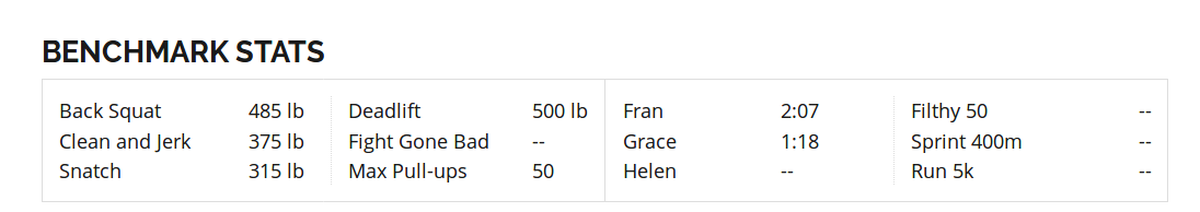
And at then bottom of the page, there is some benchmark for some exercises.
So I decided to scrape the page for all the athletes that participated in the Open during the last 5 years and that represents more than 700,000 pages to scrape. To optimize the collection I decided to parallelize the process and I used the following code to get the data for one page.
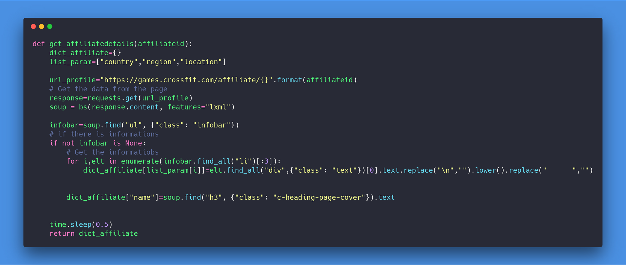
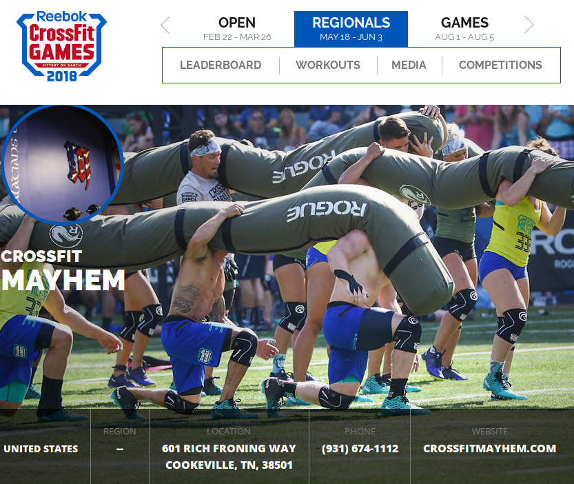
The gym pages
In the case of the gym page, the amount of information to collect is less important than for the athletes. In the following figure there is a screenshot of the page of a gym.
The script will focus on the details in the header of the page, that concern the location. The number of pages to scrape in this case is around 10,000 pages, and the following code has been used to do that.
Ethic behind the process
As you have read there is a lot of data that has been collected by my system, the question is Is this legal or not?
If I am referring to the common belief, it’s on the internet so it’s free, that’s fine, well it seems that it’s more complicated than that. If I refer to this article, it seems that I did something illegal because I didn’t respect the terms of use of the website so I decided to contact Crossfit Inc to warn them of what I have done and get their feedback on it (I contacted the organization through their form and some email addresses related to privacy etc.).
29 April 2018: I have no feedback from them on this subject.
From my point of view, I think it’s safe until I didn’t publish personal information on the athletes and sell the dataset but who knows?
Let’s have a look on some global insights of the dataset.
You can find all functions explained in this part in this GitHub repository.
Insights on the Open 2018
Overview
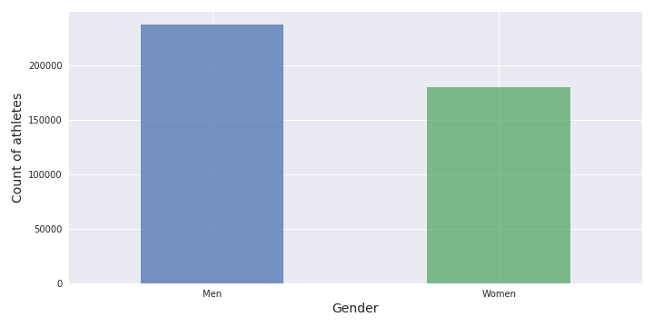
In this part, it will be mostly a very general overview of the Open event. The analysis will start with the gender distribution.
It is good to see that there is quite a similar number of men (56.8%) and women (43.2%) (similar to what I can see during my training) that were engaged in the Open. Let’s see now the distribution of the age.

The distribution of the age is quite similar between the genders, the athletes with an age greater than 60 are considered as outliers. Another point to notice is that the average age of the athletes is greater than 30 years old. This could be maybe the mark of:
- Need for experience to participate in the Open (but I will not bet on that)
- The price to be a member of a box is too high
- The video rating is not very well promoted
The following distribution graph is a good illustration of this age segmentation.

This is the illustration of the age segmentation that can be related to the income. Let’s see now the athletes data.
Analysis of the athletes
I used for this a part of the data from the athletes’ pages. I filtered the outlier data that doesn’t respect the BMI (Body Mass Index) that are not between 13 and 83, and some wrong weight and height values. There is a visualization of the morphology.

The general physique of the athlete seems to be:
- A weight around 80 kg
- A height around 180 cm
In terms of country distribution, the USA is leading the way. In the following figure there is a count of the number of athletes engaged in the event in the USA and the top 10 other countries.

I think there is no comment to make on the popularity of crossfit in the USA. If I zoom in on the other countries there are some interesting insights. In the following figure, there are more details on the top 10 countries (in terms of number of athletes) without the USA.

As we can see:
- There is a huge gap between the USA and the second country (like 200,000 athletes)
- The second country with the most important number of athletes isn’t a country, it’s the association of all the athletes that were just filming their WOD
- A clear interest from the athletes in Brazil and part of the Commonwealth
- The number of athletes engaged in Europe is less important
Let’s see now some details on the gym that was scoring the athletes.
Analysis of the gym/box data
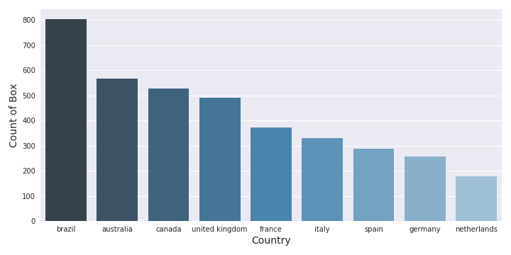
So to be clear, the USA has an important number of gyms/athletes engaged in the event. In the following there is a comparison between the number of gyms in the USA and the number of gyms in the 9 other countries with more gyms engaged.

The USA is literally crushing the other countries. In the following figure, there is an illustration of the number of gyms in the other countries.

Number of gyms in the others top10 countries
It’s interesting to see that (there is a lot of similarity between the athlete number and the gym number, which is normal):
- Brazil has an important number of gyms
- The Commonwealth (Canada, UK, Australia) is present
- France is leading Europe in the ranking (but Italy is close)
I can continue to make a lot of graphs with this data, so I decided to make an interactive dashboard that I can evolve easily at any time and for that I will use Tableau
Dashboard on Tableau Public
Tableau Public is a service that has been developed by a company in 2003 in Mountain View based on the work of Stanford University (VizQL). The company was introduced in 2013 at the NYSE and counted 2400 employees (2015 number).
There are different products developed by Tableau, but the purpose of this tool is to facilitate the exchange of data information across the business by the creation and sharing of dashboards.
I invite you to take a look at their website to have more details on the products. For this project I used Tableau Public to create the following dashboard.
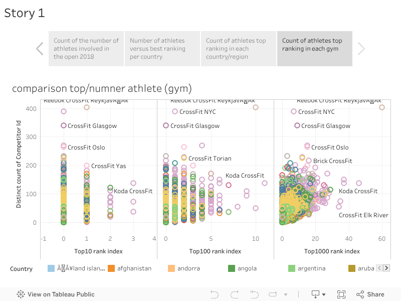
Tableau dashboard
To finish I wanted to go further on the data and just focused on the benchmark exercises, to try to find a connection between them.
Relationship between the exercises
To analyze the data, I had to eliminate the outlier values so to do that I had the choice:
- Use the DBSCAN to detect the outliers after normalization of the data (efficient but a little bit long to apply it on all the athletes with the data)
- Use the statistical approach based on the quantile and delete the values that were below the 5% quantile limit and above the 95% quantile
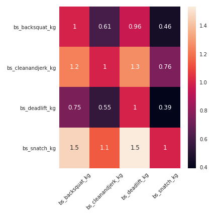
I visually found some correlation between the exercises, as the following figure illustrates the relation.

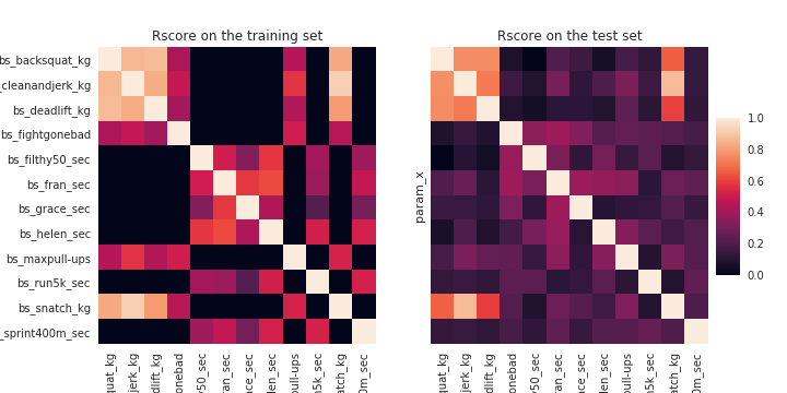
So I wanted to apply the research of correlation (a linear relation) to all the exercises. I applied a linear model on 1,000 athletes, and I tested the model on 250 athletes to see if the model was good enough. I used the r score as an index to evaluate the efficiency of the models.
On the training set, the exercises that involved carrying some weight were highly correlated to each other, the exercises that involved a duration showed a correlation that was less important. When the models were applied to the test set, the correlation for the weight exercises was still good but the exercises with time were definitely overfitting on the training set. In the following figure there is an illustration of the linear model for the exercises associated with weight.
To have a better idea of the impact of a weight modification on one exercise, I created a table that makes the conversion for a weight modification on one exercise to another.
Conclusion and next steps
This project was super interesting, the scraping of a website is definitely very practical to collect data, and there were some insights to get from this dataset (by a quick analysis).
The next steps for this project are:
- Create a Kaggle dataset (if Reebok is OK)
- Create some kind of API that will use this data to give training advice
- Based on the pictures available on the athletes’ profiles, as the age and gender are correct, create a model to determine from the face of someone their gender and age (age range)
- Add more historical data to the table (I scraped the past 5 years but the format of the past data is a little bit different) and maybe add regionals and games data
- Improve and build other dashboards
References
- Crossfit Games website — games.crossfit.com
- My first battle with web scraping — Medium / Towards Data Science
- Beautiful Soup — crummy.com
- crossfit_webscraping repository — GitHub
- Web Scraping and Crawling Are Perfectly Legal, Right? — benbernardblog.com
- Tableau — tableau.com