
For this article, I am going to start the analysis of the data extracted with the pipeline explained on this article. The goal of this article is too:
- Get an introduction to AWS athena
- Get insights on the data by using plotly
- Better understand the consumption of the video game PUBG
Reminder on PUBG
PUBG is one of this game that is define as battle royale, where the principle is there is X peoples (or squads) that are drop on an island, the goal is to be the last survivor on the island by using the items, weapons that are deploy randomly on the island. And to increase the tension in the game (and do give it an end), the part of map available is decreasing regularly to push the players to fight for their lives.
In term of gameplay, there is multiples islands available (each with its own environment like desert, snow) , and you can play in different modes (solo, duo squad) and sometimes the camera can be predefined (fpp for first person player only or first/third person camera)
Tech side
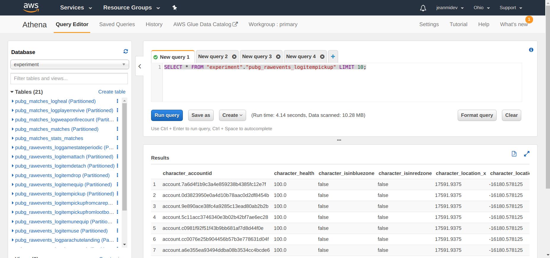
Overview of Athena
Athena is the service developed by Amazon to give the possibility to someone to easily query data from a S3 bucket without using servers or data warehouses. There is an example of the interface to use Athena on a web browser.
The system developed is pretty open in terms of data format that can be used CSV, JSON, ORC, Avro, and Parquet.
The core of the system is build on Presto that is defined as an open source distributed SQL query engine. One of the main user of this project is Facebook on various topics around interactive analytics, batch ETL, A/B testing and developer advertiser analytics.
There is a good article about Presto that is entering more in details on all the machinery of the engine.
Some other big users of this tool are Netflix and Airbnb that are building services around this kind of system.
If we go back to the Athena service, the serverless system is interesting because the billing is only based on the data scanned. So really this combo S3 + Athena is a good mix for people who wants to handle a volume of data that can be consider “big” without handling all the infrastructure (that is a full time job).
To connect AWS Athena to a python script there is a package pyathenajdbc that can be installed and will install a connector that can be use in a pandas dataframe. There is an example of a script to connect the data.
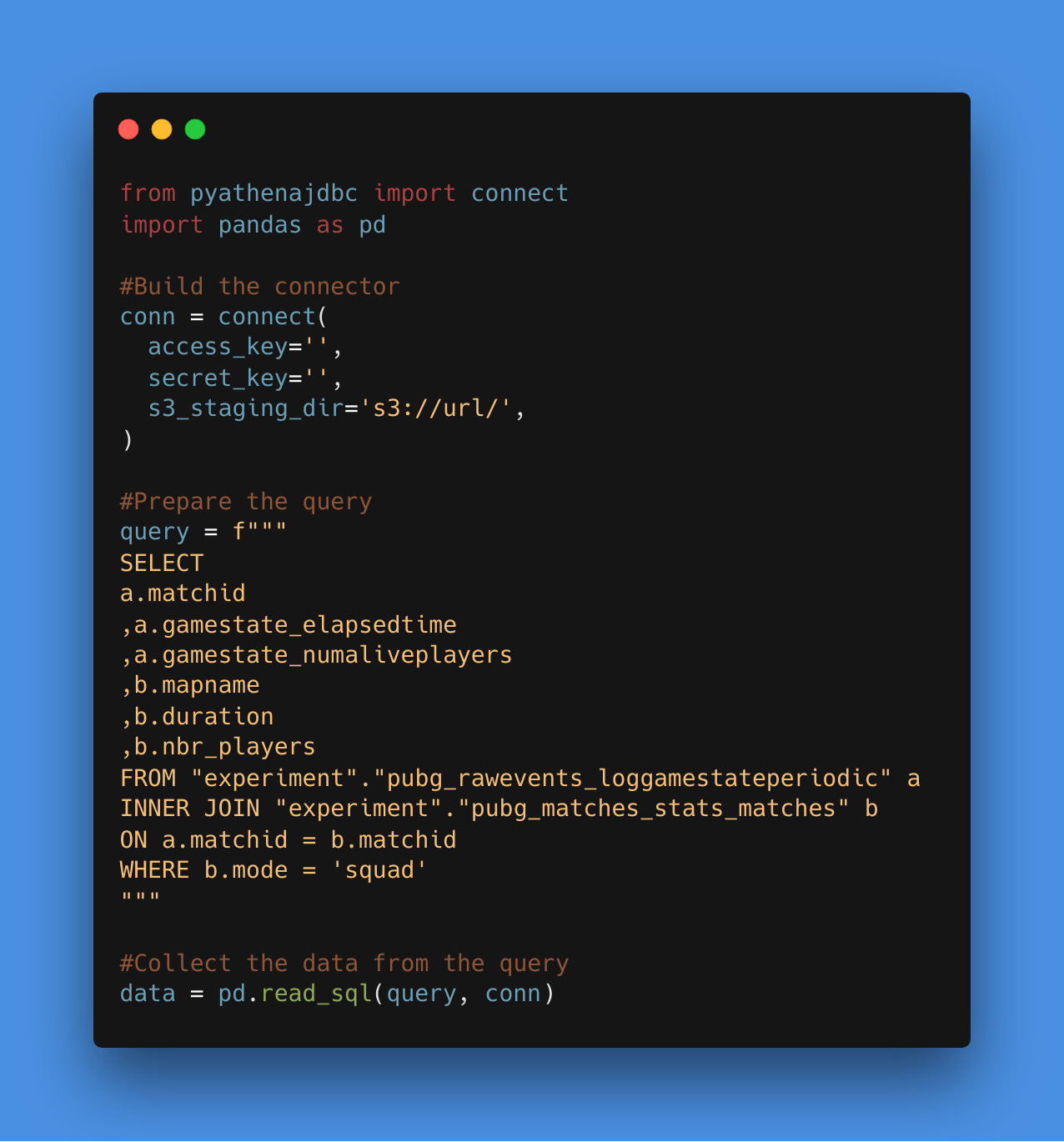
The code is quite simple and looks like call to a classic postgreSQL database. To be really transparent in terms of cost there is a graph with the cost for the experiment.
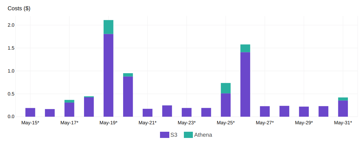
The real amount is the one that is coming from the S3 reading and Athena activation and it’s less than 2$ per day of analysis (that are just 4 for this experiment).
Let’s start the analysis of the data associated to PUBG.
Status on the data collected
The pipe ran during more than a month between the 26th january 2019 and the 5th April 2019, this amount of time represent around 69000 matches so that a pretty interesting volume of data to handle (with the amount of events collected during the match).
In terms of area and platform, the pipe was focused to extract the data from the PC platform in north america.
I am going to focus on 3 events for this analysis:
- The gamestat periodic, that is around 11 000 000 rows
- The player kill, that is around 7 000 000 rows
- The items used, that is around 19 000 000 rows
Plotly and co
I am a pretty big fan of the library plotly I did an article last year on a Shiny like python package call Dash powered by plotly, it’s really a cool package that makes the building of dashboard more easier in Python.
The package has been developed by the company Plotly that is based in Montreal in the mile end so we are literally neighbors (really like 4 minutes walking time).
The original package is a really cool library that is free to make interactive plot based on D3.js, they offer the possibility to deploy on the their chart studio the plot that are produce (the free version offers you the possibility to host 25 charts on their platform but with a premium account you can host more charts/data)
In term of usage, the original syntax is a little bit “heavy” so there is people that have developed wrappers to facilitate the building of a graph on a more one liner style:
- Cufflinks developed by Jorge Santos (and many contributors)
- Plotly express developed by Plotly themselves
For this article I have only used cufflinks but I am planning to make others articles that will use plotly express.
PUBG from different perspectives
Data extracted
To be honest there is multiples websites than have done similar analysis like PUBGmap.io but it is still interesting to make different analysis and make some comparisons.
There is a representation of the matches collected based on the map and the mode.
The mode that is the most popular is the squad one, and the map is Savage. For the following analysis, I am going to focus on the mode squad.
Duration of the matches
In term of duration , I took a sample of the match (1000 matches) for each map and there is some boxplots.
The map Savage looks to have a different comportment on the duration, that could be explained by the size that is way smaller than the other ones (there is like a 5 minutes differential for the median).
Evolution of the matches
For the lifespan of the players, in the following figure there is the representation of the percentage of player alive VS the completion of the match in function of the map.
At the beginning of the match , most of the players stay alive that is related to the landing moment of all the players on the map. In terms of evolution of the players alive, the map seems to not have the same evolution to the end, the map to be “smoother” than the other one, Erangel and dihorotok are very similar and Savage is the one that seems the most violent (and that can explained by the format of the map).
Weapons usage
In term of weapons used to kill there is the distribution of number of kills per weapon during the period.
There is multiple types of weapon in the game from handgun, rifle shotgun or crossbow but the most popular is the AK47, and there is a lot of rifles in the top of the weapons.
Another really interesting data from the kill event is the localisation on the body of the final shot, in the following figure there is the repartition for each weapon of the localisation of the final shot.
The portion of headshot is different in function of the weapon, the handguns look way less precise to do headshot than the rifle (and that makes sense)
Another interesting insights is that some weapons seems to be map specific, in the following figure there is a distribution of the weapons per map.
Support items usage
To conclude I decided to have an overview of the heal and booster usage in the game, there is in the following figure the evolution of the events to use an heal object and a booster object in function of the completion of the match.
For the booster, there is definitely a peak around 40% of the match, but for the heal object there is a first bump in the 15% that refer to the first wave of eliminated player, the peak is on the middle of the match with a second phase of elimination.
Conclusion
This article was an introduction to more works that I am going to do with the data collected from PUBG, I will give a focus on a future article on PUBG about the position data , this dataset represent around 500 000 000 rows so that is going to be more interesting.


