
You can find the template for this dashboard in this Github repository.
Hello, in this article I am going to explain the process that I followed to create a dashboard that displayed some personal informations. To realise this project, I decide to use Dash a Python framework that has been developed by Plotly a canadian company that develop the library Plotly to make interactive data visualisation.
In this article, I am going to explain:
- The data involved
- The back end of this project (and some tips to make your own)
- The dashboard, his deployment and components
Introduction on tha data
In our day to day life, we are generating a lot of data and as a data scientist I liked to play with data. In my case, I have some smart devices like a smart scale or a smart band that I am using every day, and I have some applications to monitor some aspect of my life like Strava, in this context I am interested by the following data sources:
- my smart scale data from Nokia devices
- my running sessions on Strava
- my crossfit exercices
For the first two data sources, I have an application to follow the evolution of different metrics
So that’s great, but one service/device = one application, it’s not very efficient to make a quick monitoring of what happened. But who said application said potentiel API for developers and in that case there is one (Nokia and Strava).
The last data source is more an “old school” data source because it’s simply a Google spreadsheet that I am filling every week with the different exercices that I completed during my crossfit sessions. I found it a good and efficient way to keep track of what I am doing at the box and see the progress. There is an API that offer me the possibilities to access this data source.
So all the data are available for my project.
Let’s see now the structure of the back end that will expose the data for the dashboard.
Back end description
For this project, the backend is hosted on Amazon Web Services. There is an illustration of the back end of the project.
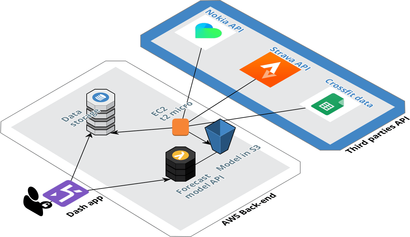
Structure of the back end
This back end is structured around two elements, the data pipeline for the data collection from the different API, and the API that will offer the possibilities to get a forecast of the weight and the fat ratio.
Building the data pipeline
For the collection of the data, the pipeline is hosted in Amazon Web Services, I have an EC2 instance (the one from the AWS free tier) that is collecting periodically (every 3 hours) the new data that have been pushed in the different sources. The data collected are cleaned and send in 3 differents DynamoDB tables.
The pipeline is very simple, for the configuration of the DynamoDB table I setup a very small writing capacity of 2 units but for the reading I decided to use the auto-scaling feature to set a dynamic reading capacity between 10 and 50 units in function of the traffic.
Deploy a forecast model
DISCLAIMER: This is not a super efficient model but at least it exists
The model is very simple but not very efficient, I am currently having a model for the weight and another one for the fat ratio.
It’s a simple KNN model in each case that it take the following inputs:
- the distance ran during the week
- the time ran during the week
- the number of sessions of crossfit
- the average weight carried during crossfit exercices (with weight)
The model will predict the weekly variation of the weight and the fat ratio.
The model will be updated every week and send in a S3 bucket. To access the model directly from the dashboard I create an API with Flask that I deploy in a Lambda with the Zappa package that I used for my article on the messenger chatbot.
Data collection
As I said previously, there is three API to connect to our back end:
- Nokia API
- Strava API
- Google drive API
Let’s have a look on each data source.
Nokia API
With this API, I started to collect the data since February 2017, I have my smart band since July 2014 and my smart scale since November 2014 and I loved these devices, their design is nice the application is good.I hope that all the rumors about Nokia that will stop this branch are wrong.
Nokia devices (withings branded but it’s the same thing now)
I created a script that was calling the API with GET requests (super long in term of lenght), honestly I think that the API of Nokia is the most technical API that I used so far (in comparison to Netatmo that is for me the easiest API to use) but at least it was working during the past year.
For this project I tried to make some adjustments and I litterally break everything so I decided to use this GitHub repository to manage the connection with the API and it’s working great !!
Strava API
I am using Strava since September 2016, I was a Runkeeper and a Runstatic guy before but I decided to switch when I arrived in the UK in 2017.
Honestly the API of Strava is super easy to use, just create an application get your access token and make GET request to get your past activities.
Crossfit data (Google drive API)
I am currently practicing crossfit since August 2017, as I said previously, I am monitoring my trainings in a spreadsheet on Google sheets.
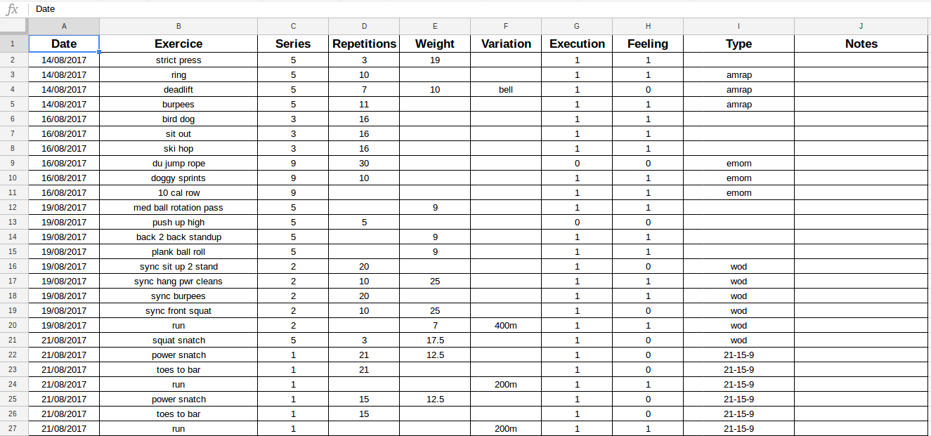
Capture of my Google spreadsheet
It’s an old school way to do it but I found it more efficient than an application to collect the data.
I am using the Google Drive API and this tutorial made by Twillio to setup a python script that will collect the data. Another way to do it, is to use Sheetsu as I have some Google credits I decided to not use this service (I used in the past for an Alexa skills and it’s great).
Analytics
Weight data
Like I said previously, for this data source I will keep focus on the data from the scale, the parameters are the weight and the fat ratio.
In the following figure there is the representation of the historical data for my weight for the past year.
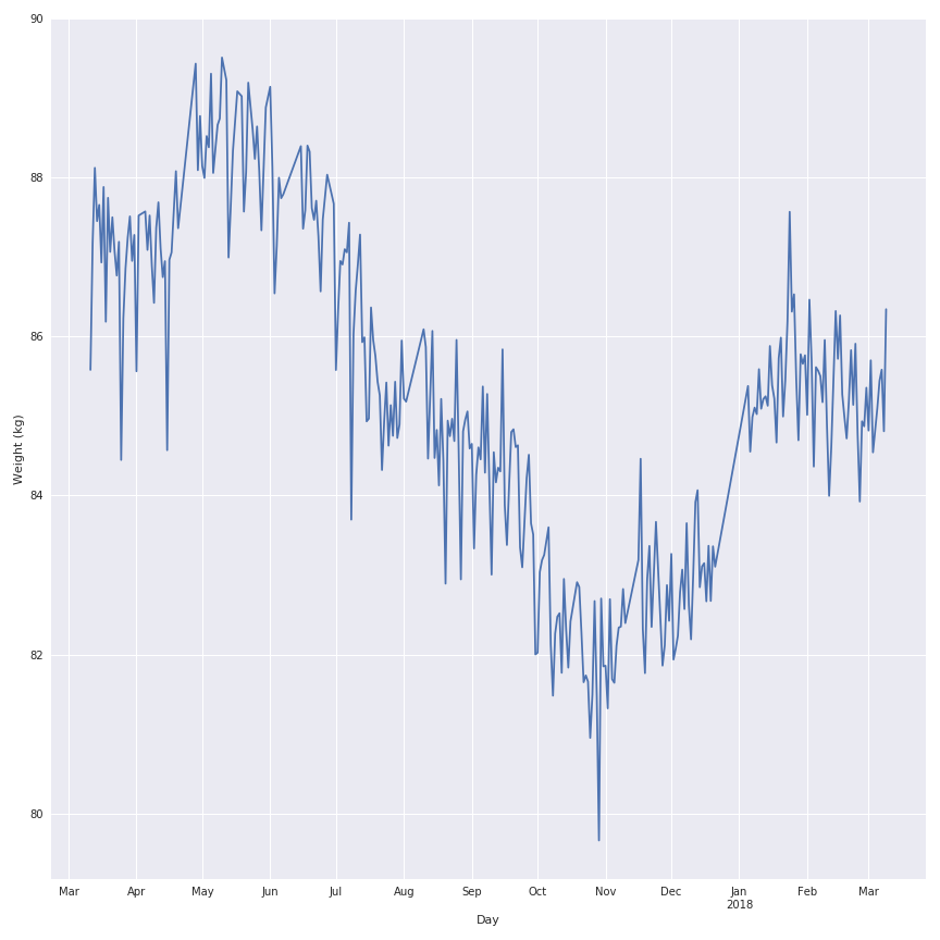
As you can see there is a lot of noise in the evolution of the weight during the past year so I will apply a rolling mean function on the signal to make it looks nicer and keep the trend of the behaviour.
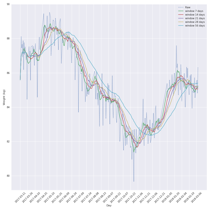
The most interesting window seems to be the 7 days window because this one keep the local variation but is not affect by a lag effect that will corrupt the analysis of the data.
The conclusion on the variation are the same for the fat ratio.
Another element to analyse could be the weekly variation of the metrics to illustrate the good and bad week and maybe detect the interesting period (gain of muscle or fat for example)
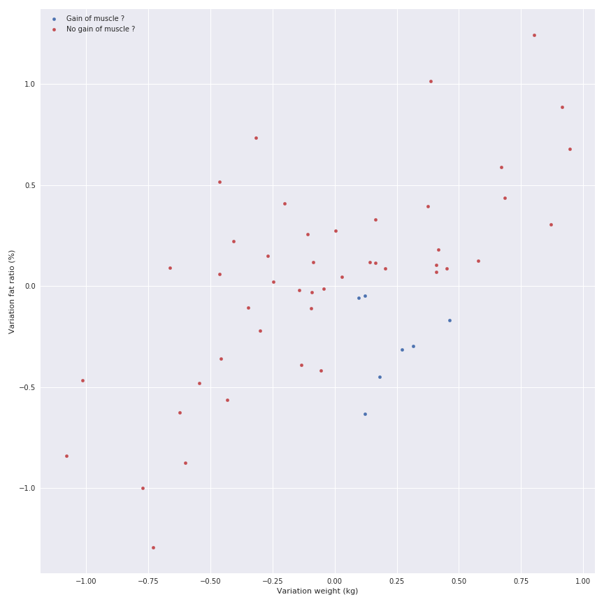
There is a linear relation between the gain of fat and the gain of weight, but I don’t want to display it because I know that there is some phases where you can gain weight but lose fat (gain of muscle) so the relation doesn’t exist.
Let’s have a look on the Strava data.
Running data
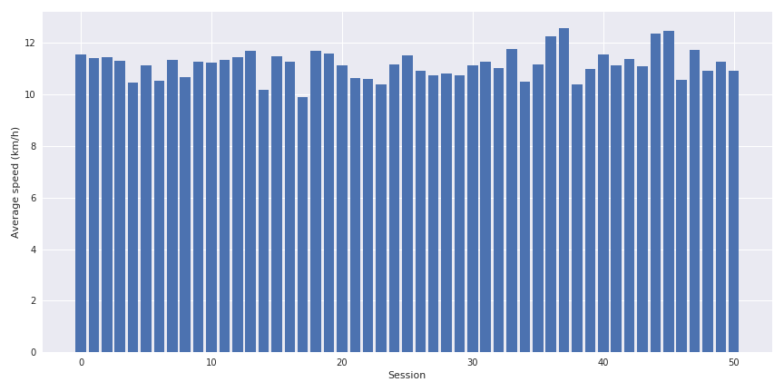
I am basically running one time per week in average around 10 km in less than one hour.
The interesting metrics for this data source are:
- the distance
- the average speed
- the elevation
- the time elpased
Some very simple bar graph can be displayed on the evolution of these parameters.
The interesting point is to cross the distance, the average speed and the elevation together to see the impact of the last parameter on the speed.
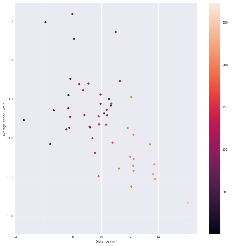
We can see the impact of the elevation on my average speed. But let’s be honest this data source is not very exciting (I am also collecting the details of the running sessions like the speed during the session etc but I am currently doing nothing with these data).
Let’s have a look on crossfit data.
Crossfit data
I am practicing crossfit since August 2017, 3 times per week and I am definetly not a pro. In the following figure, there is a visualisation of the total weight carried during a session in function of the number of repetitions.
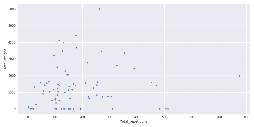
Weight carried in function of the number of repetitions
This figure is a good illustration of the variety of sessions that can happened in crossfit, some where you can carry a lot of weights, without too much repetitions and in the contrary some with a lot of repetitions and not too much weight.
Another interesting part is to see the evolution of the weight between the sessions for one exercice (and yes I am progressing a little bit).
So the quality of the data depends on my motivation to write it correctly in the spreadsheet but the quantity of informations is quite interesting.
Now it’s time to create the dashboard that will display all these informations.
Design of the dashboard
For this dashboard, my requirements for the application are :
- Easy and cheap to deploy
- Authentification process to access the dashboard
I see people say “oh you should use R Shiny to create your application because ..” and I will say.
Honestly I am not a big fan of R, I know how to use it but I found it quite limited when I want to do more advance computing stuff that are not data analytic related.
And I want to write an article on Dash, so let’s dash.
For me it’s important to have the following sections on the dashboard:
- An overview of the data (like the last value, and some quick statistics)
- A section for each data sources
- A forecast section where I can use a little bit of ML
I invite you to use the code and the environnment in this Github repository to start.
Presentation of the dashboard
In this section, I will describe and present the dashboard in his latest version (before the final css “coup de poliche”).
For the style of the application, I used the following resources:
- Inspiration/super base for the metrics thanks @Jamie for the link.
- Bootstrap 4
- Support of @Marius for the final css
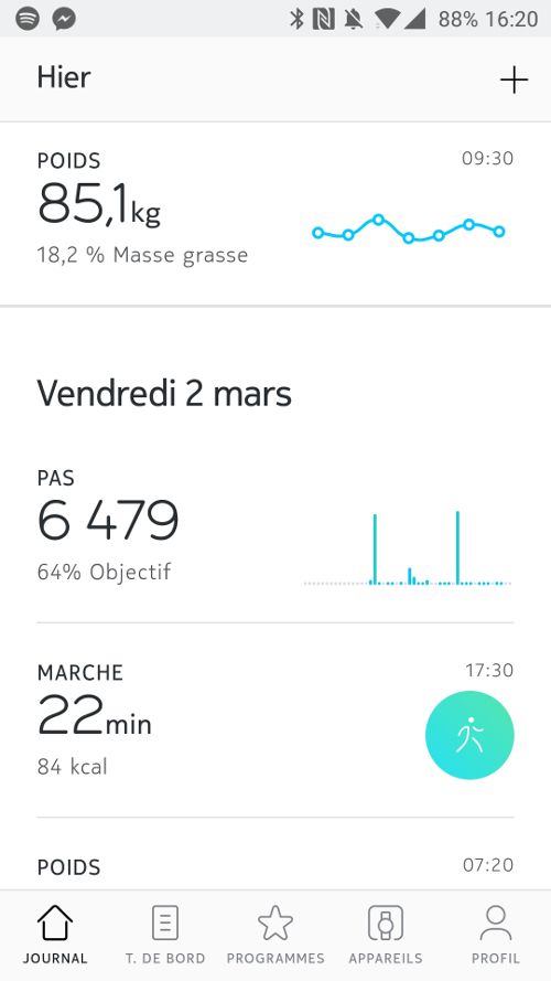
The overview section
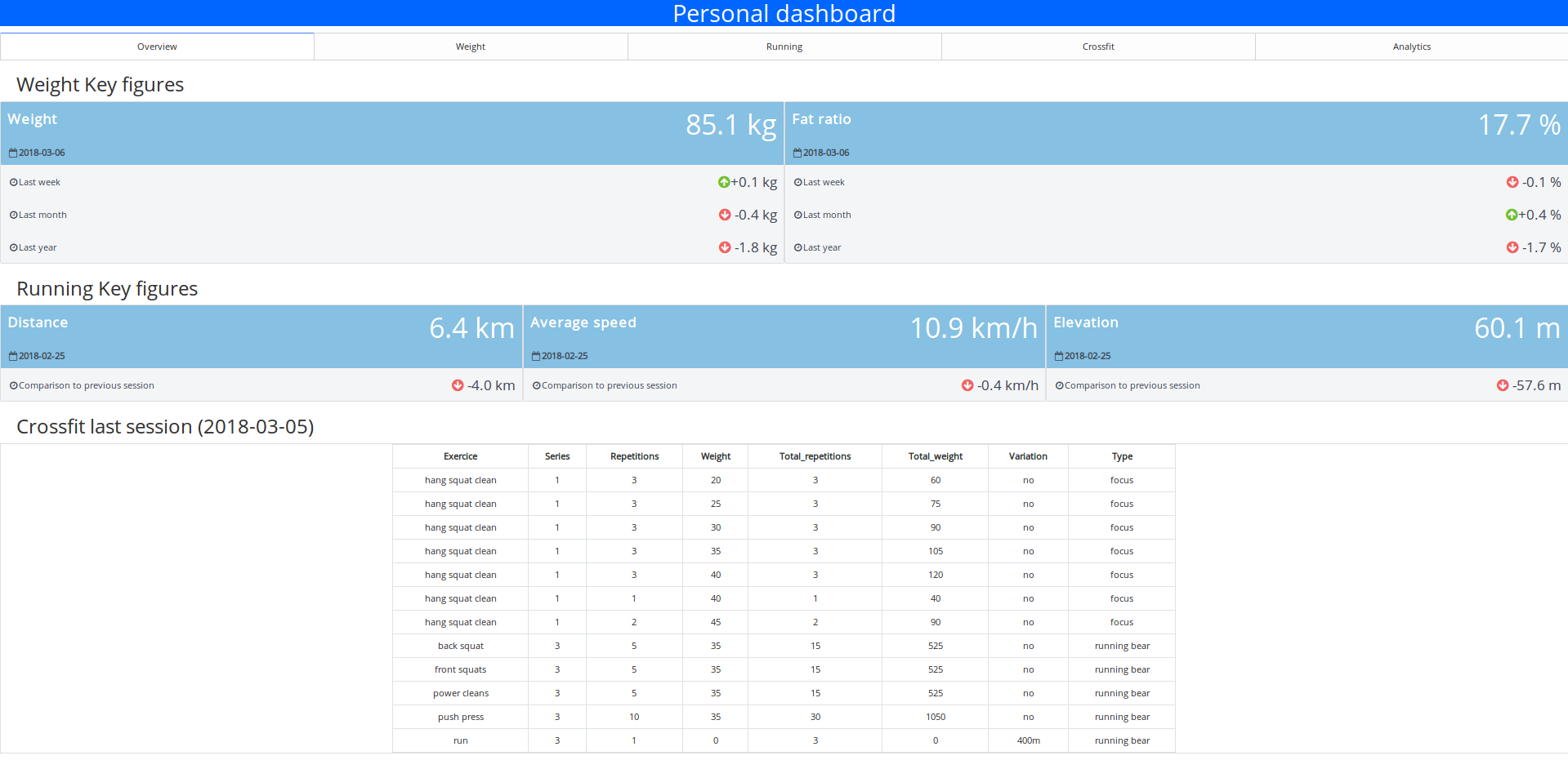
In this section the idea is to offering to the user a very clear ans simple overview of the different metrics and a quick insight on their evolution.
There is a first part where some informations on the weight and the fat ratio are displayed.
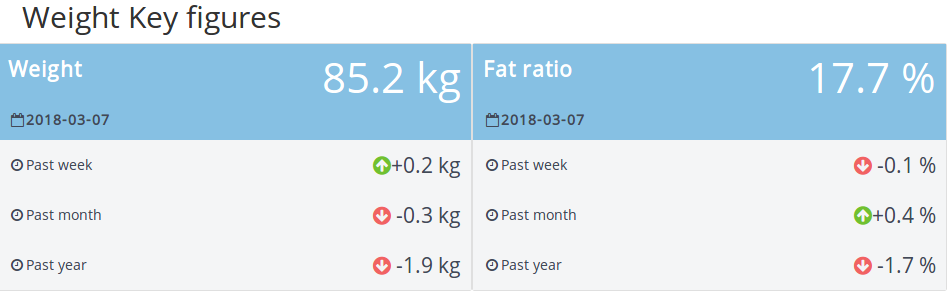
There is for each parameters:
- The last measurement (and when he happened)
- The evolution of the metrics on different periods (since last week, last month and last year)
I found this part very rich in informations, it’s easy to understand and you can see the trends (so perfect for my parents)
This section is followed by another one with the last running session, more simplest.
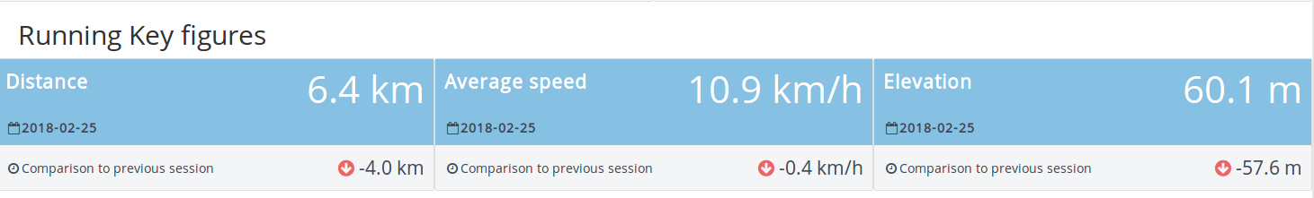
There is some informations on the distance, the average speed and the elevation followed by a comparison with the previous session.
For the rest of the section, it’s a table that contains the exercices of the last crossfit session so nothing really exciting no need of a zoom.
The weight and running sections
For the two following sections, it’s basically some very basic figures where I take the visualisation from this article.
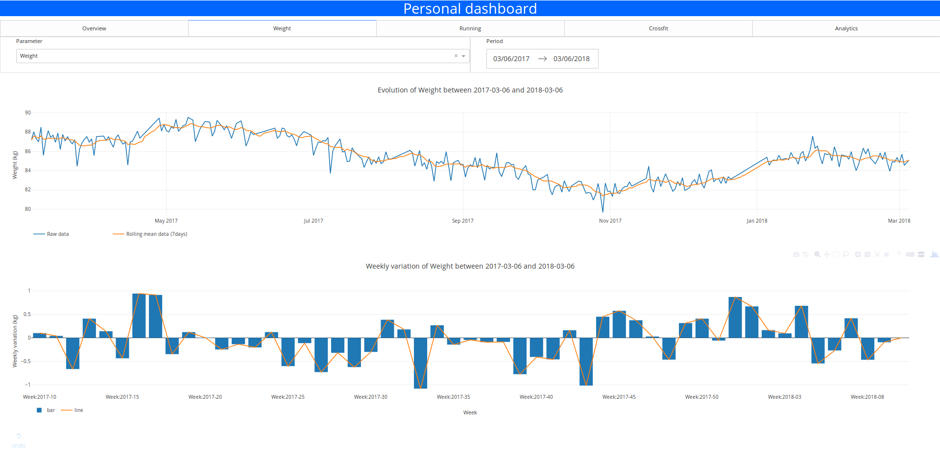
The user can select the time period and the parameter that you want to visualise with the inputs element. He can select the parameter and the range of data with the dropdown panel and the date range picker

The layout is super simple but it’s functional.
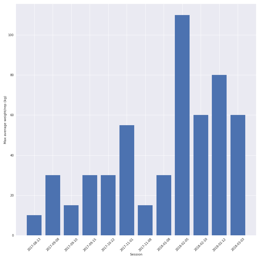
The crossfit section
In this section, I choose to cross the metrics index and the inputs options of the previous sections.
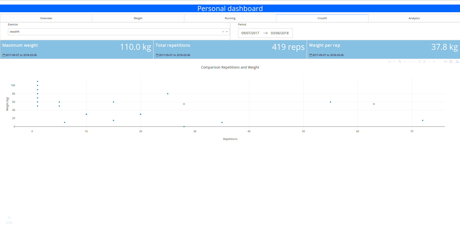
You can select the exercices and get some quick statistics on it:
- The maximum weight carried
- the number of repetitions executed
- the average weight per repetition
- the graph of repetitions vs weight
It’s simple but quite useful when I want to find quickly my 1 rep max weight.
Forecast section
In this section it’s basically the control panel to call the API that contains the model.
The user can select the forecast period and the weekly training settings and get an idea of the evolution of the weight and the fat ratio at the end of the forecast period.
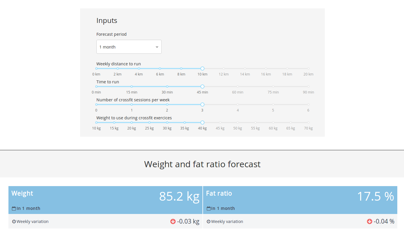
Forecast section
Maybe not accurate but at least it’s here and it will definetly become better with more data (the model is trained on 30 points).
Conclusion and next steps
So the prototype is working great and deployed on Heroku (if you want to have access you can contact me). It took me 2 weeks to do it (week end and lunch break) so I am quite happy with that.
You can find all the code (at least the skeleton of the app) in the Github repo.
The next steps are:
- Try maybe an alternative with Flask and D3.js
- Add more data, maybe a food index
- Implement a visualisation of the running session details (leaflet could be a good start)
- Find some other metrics to display
- Get some feedbacks from the users


,%20AWS%20and%20Heroku)